Even companies like Google find they need to update their logo. We’ve put together a list of 16 logo characteristics that indicate your organization might be ready to make the change.

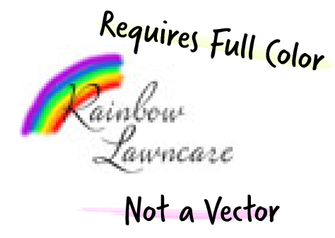
1. Not a Vector
If you don’t have a vector image of your logo, you will see pixels when your image is stretched beyond its original size. It might not print clearly either. A vector image can be magnified as big as you need it without worrying about pixels. File formats include .EPS and .AI.
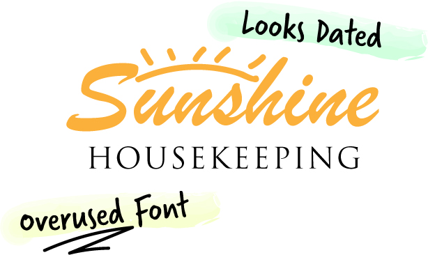
2. Uses an Over-Used Font
If others were able to tell you the name of the font used in your logo, it’s likely you are using an overused font.
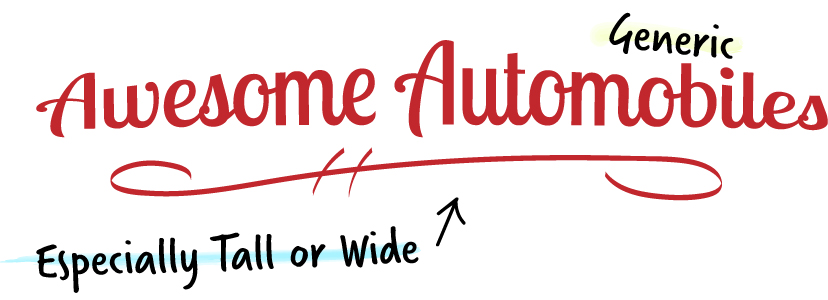
3. Generic
Your logo should communicate at least something about your field of business. Your café logo should not work equally well for a medical center or law firm.
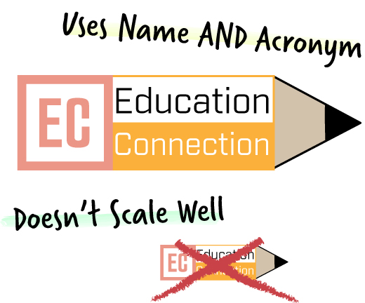
4. Doesn’t Scale
Some logos look great stretched across your computer screen but become less effective scaled down to fit on a business card. Also, a less than technically sound illustration will reveal all of its messy details when printed on a 4’ x 8’ banner.
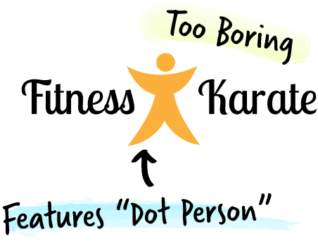
5. Has a “Dot Person”
Dot person, swoosh man, stick figure – if the symbol in your logo has become a “thing” in the world of logo design, you should think about getting a new logo to better differentiate your organization.
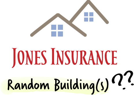
6. Includes Random Building(s)
Nothing screams clipart louder than random buildings that have nothing to with your business or geographic location.
7. Too Boring
If you are an exciting and fun business or organization, you logo should feel that way, too.
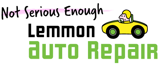
8. Not Serious Enough
If you want to earn trust and esteem for your knowledge and professional skill, your logo needs to communicate seriousness. Skip the mascot and hand-drawn elements.
9. Doesn’t Work in Black and White
As convinced as you are that you will always print your logo in full color, you will most likely be faced with a situation that requires your logo in a single color. Be prepared with alternatives.
10. Especially Tall or Wide
An awkward shape limits your ability to place your logo neatly and can cause your brand to stand out in a negative way. If the name of your organization happens to be very long, consider using a symbol or signet that can stand on its own.
11. Uses Both Name and Acronym
Repeating the same letters can get… repetitive.
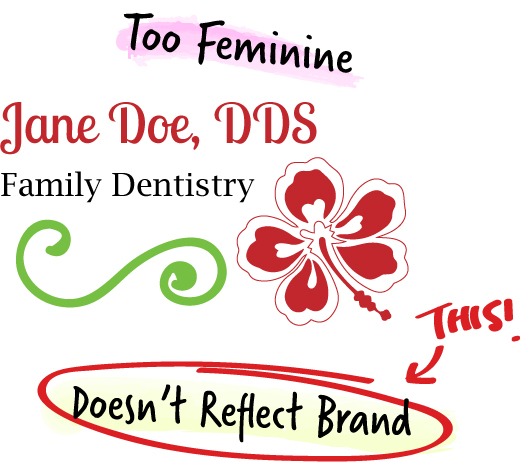
12. Too Feminine
If you are targeting a male audience, skip the flourishes and pastels.
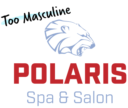
13. Too Masculine
Likewise, if you are targeting a primarily female audience, avoid overly square typefaces and the “sci-fi look”.
14. Looks Dated
It’s great that you’ve been in business for 40 years, but your logo shouldn’t look like it was designed then. Experience is valuable, but being up-to-date is equally important. For a frank analysis, ask your nearest college or high school student.
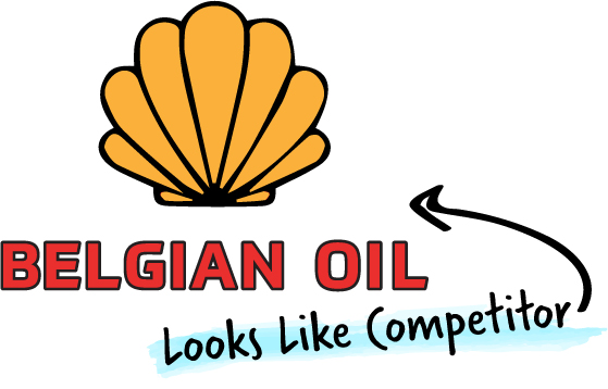
15. Looks Like Your Competitor
Just because everyone in your industry uses the same color or design style does not mean that you have to. Be memorable by being different.
16. Doesn’t Communicate Your Brand
Because your logo is so closely connected with your brand, your logo needs to represent the values and service that define your identity. As an organization grows and adapts, its identity evolves. Perhaps your business has undergone a merger or major transition and is ready to portray itself differently. Does your logo reflect who you are today?